How Much The World Has Developed Since 1990

This fascinating map (source) was making the Internet rounds last week showing how much countries around the world have developed since 1990. While the map does have some biases and the groupings + colors are a bit misleading, it does paint a broad strokes picture of how much the world has improved within my living memory.
I was born in 1985 and moved to The Philippines in 1990 and distinctly remember living conditions there. The last time I went back was 2005. There was still massive poverty and inequality, but there had also been massive improvements in quality of life.
That’s my personal anecdote, but the United Nations does have an objective measurement for broad-strokes human improvement. It’s called the Human Development Index.
The Human Development Index is a critical measure of a population’s well-being. It combines health, education, and cost of living adjusted income levels to compare countries across place and time.
Health is measured with life expectancy at birth. Education is measured with Expected years of schooling of children at age 6. Income is measured with Gross National Income at Purchasing Power Parity (PPP). Read more about it on Wikipedia.
The map above groups countries all together, which can be misleading. To get a better picture, here’s the same map comparison with subnational groupings and shaded ventiles. Get the original data here.
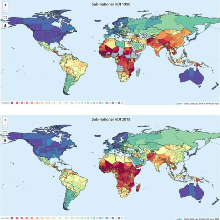
With the more nuanced map, it’s still striking to see the improvements overall – though it’s easier to see the massive gaps that remain and the fact that wealth gains are still concentrated within cities (note Rio in Brazil and Shanghai in China and Mumbai & Bengaluru in India).
Either way, consistent incremental improvements over time lead to huge changes in both individuals and countries.


